 Ekaterina Skalatskaia
Met Gala of packaging: 5 iconic campaigns that dressed to impress
Inspired by the Met Gala 2025: “Superfine: Tailoring Black Style” When we think of the Met Gala, we think of jaw-dropping silhouettes, daring fashion...
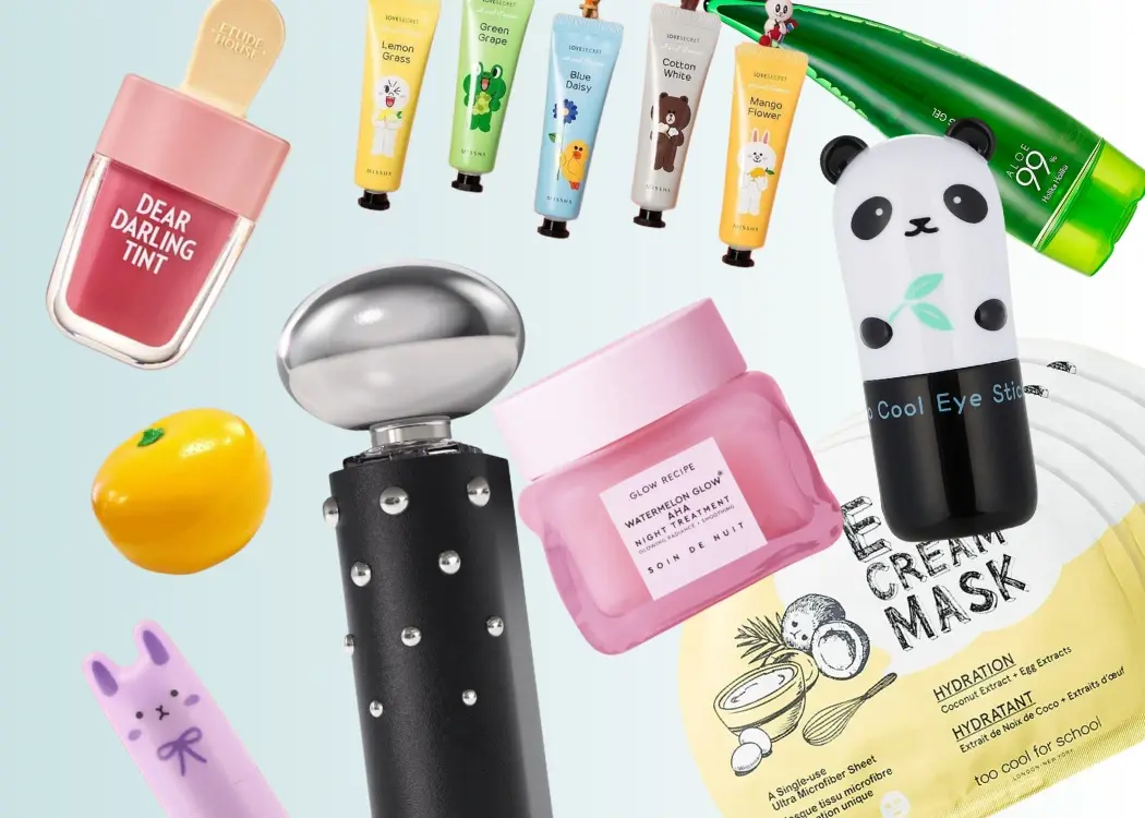
Let’s be honest: we all love a good serum, but when it comes in a bottle shaped like a milk carton or a cream that looks like a peach? Take. Our. Money.
Korean skincare has always led the game with innovative formulas — snail mucin, fermented rice water, and glass-skin secrets, anyone? But recently, there’s another reason people can’t get enough: the packaging. Think pastel tubes, dreamy jars, cartoon characters, and playful designs that are basically made for Instagram (and your bathroom shelf).
But this isn't just a story about cute packaging. It's a deep dive into how Korean beauty brands are setting the pace for global skincare aesthetics in 2025 — and why brands everywhere are taking notes.
Here’s a stat that’ll make you blink: Korean beauty exports hit an all-time high of over $10 billion in 2024, with Europe and the U.S. leading the charge in year-on-year growth. That’s not just about powerful serums and revolutionary formulas — it’s about products that look as good as they perform.
Let’s face it: we don’t just buy skincare anymore. We buy vibes. We buy the promise of glowy skin in a dreamy frosted bottle. We buy a minimalist jar that whispers "I'm expensive" from your bathroom shelf. And Korean brands? They’ve cracked that code — hard.
Packaging in K-beauty isn’t an afterthought. It’s part of the product’s identity. It shapes first impressions, feeds the Instagram machine, and turns casual buyers into collectors. When you see a jelly cleanser in a honey pot or a moisturizer that looks like a literal peach, it’s not just cute — it’s strategic. You're not just buying skincare; you're buying an aesthetic, an aspiration, a mood.
This is where psychology kicks in. Consumers often perceive beautifully packaged products as higher quality — even before they try them. It’s called the “halo effect,” and it’s alive and well in the beauty aisle. A clever design can make a $12 cream feel like a $60 indulgence.
Need proof? Let’s talk viral hits:
Glow Recipe’s Watermelon Glow Sleeping Mask — the juicy pink jar is practically skincare royalty on social.
Tony Moly’s Panda’s Dream Eye Stick — it’s a panda. It’s a balm. It’s everywhere.
Peach Slices’ Peach Pudding Makeup Cleanser — looks like dessert, cleans like a dream, and is flying off shelves in the U.S.
Too Cool For School’s Egg Cream Mask — part skincare, part visual joke, part must-have.
All of these products exploded thanks to packaging that made people stop scrolling, take a screenshot, and say “I need that.”
For Korean brands, design isn't decoration — it's differentiation. And in today’s crowded beauty landscape, that can mean the difference between blending in and blowing up.

Eco-consciousness is no longer optional — it’s expected. In 2025, Korean brands are leading the charge with biodegradable cartons, refillable pouches, and glass bottles that are both beautiful and better for the planet.
Take Innisfree, for example. Known for its eco-friendly ethos, the brand has recently launched a refill station in Seoul and is testing FSC-certified paper bottles. The packaging is clean, green, and still 100% aesthetic.
Not everything is bright and bubbly — some brands are embracing minimalist elegance. Clean fonts, soft-touch matte finishes, and pastel palettes are dominating bathroom counters.
Brands like Tamburins and Huxley are nailing this vibe. Their packaging feels like it belongs in a boutique hotel spa: sleek, artful, and oh-so-Instagrammable.
Cultural storytelling is a growing design driver. From historic fonts to ingredients rooted in tradition, brands are embedding identity into every box and bottle.
Beauty of Joseon is a perfect example. Its hanbok-inspired visuals and references to Joseon dynasty beauty rituals lend the brand a rich, authentic narrative — connecting modern consumers to centuries of skincare wisdom.
Then there’s the fun side — the part that makes you squeal with joy when you open a parcel. We’re talking serums in banana bottles, creams in apple-shaped jars, and face masks with cartoon characters.
Tony Moly, Etude House, and the ever-iconic Holika Holika continue to tap into this playful, whimsical aesthetic. And it works — Gen Z and millennials love products that double as decor or go viral on social.

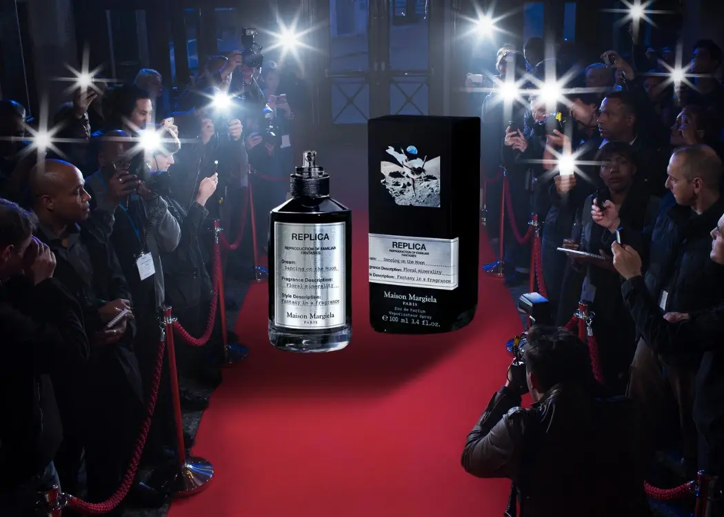
And this obsession with creative packaging isn’t limited to skincare. It’s popping up across industries — from luxury perfume bottles to snacks that double as fashion statements. Just take a look at how brands are drawing inspiration from pop culture events like the Met Gala to influence packaging design. It’s proof that visual storytelling is becoming a universal brand language.
Laneige’s Water Sleeping Mask isn’t just a bestseller — it’s a global phenomenon. With soft blue hues, subtle gradients, and frosted textures, the packaging feels like a dreamy night cream ritual. It’s luxurious but accessible, and that’s a big part of its Western success.
Founded by two Korean-American beauty execs, Glow Recipe is a crossover sensation. Its fruit-inspired packaging (the Watermelon Glow line is iconic) is unmistakable. But this isn’t just about looking good — their packaging is glass-based, sustainable, and made for display.
Loved by influencers and dermatologists alike, Beauty of Joseon combines hanbang (traditional Korean herbal medicine) with minimalist packaging that appeals across cultures. The glass droppers, ink-style typography, and beige palettes are quietly luxurious — and wildly photogenic.
No frills, no fuss. COSRX’s medical-grade look (white boxes, blocky text) feels different in a sea of dreamy creams. It communicates: “We’re here to solve your skin problems.” But don’t be fooled — the packaging still has that refined Korean polish that wins over minimalist skincare fans worldwide.
Rising fast in Europe, Dr. Ceuracle nails the pharmacy-meets-beauty trend. With pipettes, serif fonts, and subtle textures, it feels clinical yet premium. And with a cult following on TikTok, it’s fast becoming a mainstay on Western shelves.

For designers, marketers, and artwork teams — especially those managing global packaging pipelines — K-beauty offers more than just eye candy. It’s a roadmap for relevance, resonance, and real-world results.
Here’s what the smartest teams are taking away:
Beautiful packaging adds perceived value. A well-designed product feels premium, even at an affordable price point — and that can justify higher margins or better positioning on the shelf.
Every box, jar, or pump is an opportunity to tell a story — about your brand’s origins, values, or mission. K-beauty brands use this space to evoke history, culture, or emotion. This creates a deeper, more memorable connection with the buyer.
Unboxing is no longer a side effect of a purchase — it is the experience. Memorable packaging drives shares, reviews, UGC, and long-tail engagement. In short: it fuels your marketing engine.
Trend cycles are faster than ever. What’s hot today could feel outdated in six months. That’s why packaging teams need agile tools to test designs, approve artwork, and go to market faster — without compromising quality.

The most successful brands aren’t just following trends — they’re building entire strategies around design. From startups to global giants, we’re seeing more examples of how smart packaging can shape perception and boost growth. Check out these real-world packaging success stories for a closer look at how design decisions are turning into business wins.
For teams working in packaging and artwork design, Korean beauty is more than just a trend — it’s a masterclass in how design drives sales, brand loyalty, and market expansion. These brands prove that packaging is no longer just a container; it’s part of the product’s identity. It creates emotional connection, communicates brand values, and influences buying decisions before anyone even reads the ingredients list.
But while inspiration is everywhere, turning those ideas into reality — across multiple SKUs, languages, markets, and deadlines — is a different story. That’s where Cway® comes in.
Cway® helps packaging teams bring their best concepts to life faster and with fewer errors. By streamlining the entire artwork lifecycle — from creative development to compliance and launch — Cway® gives global teams the structure they need to move quickly without sacrificing quality. Designers can prototype more freely, stakeholders can collaborate in real time, and project managers can track every asset and approval across markets with clarity and confidence.
As K-beauty teaches us, great packaging isn’t just decoration — it’s a business driver. At Cway®, we enable brands to respond to trends in real time, localize efficiently, and deliver packaging that resonates, converts, and delights. In a world where visual impact can make or break a product, Cway® empowers teams to turn creative ambition into market-ready packaging that stands out — on the shelf, online, and everywhere in between.
Inspired by the Met Gala 2025: “Superfine: Tailoring Black Style” When we think of the Met Gala, we think of jaw-dropping silhouettes, daring fashion...

World Fair Trade Day, celebrated annually on the second Saturday of May, is more than just a symbolic event—it's a powerful call to action. On May...
As pet parents, we spend time choosing the right food — the one that promises shiny coats, strong joints, or grain-free digestion. But there’s...